


Marker Palette of Copic
The whole palette of Copic consists of 357 colors plus a blender. It is immediately worth noting that there is no need to collect it all. Many colors and shades are so similar that it is difficult to distinguish them on paper. The palette is very logical and is formed taking into account the main characteristics of color: tone, saturation, and lightness. They are indicated on the caps. Now let's figure out how to read them correctly.The letters
Inside, the palette is primarily divided by tone (letters):BV - blue-purple
V - Purple
RV - red-purple
R - red
YR - yellow-red
Y - yellow
YG - yellow-green
G - green
BG - blue-green
B - blue
E - earth
And a group of gray colors :
C - cold gray
W - warm grey
N - neutral grey
T-toner grey
The first digit
Inside, each color is divided into a mixing group - gradient groups or groups for mixing.Each group is colors of the same shade and saturation, giving a smooth gradient.
For example, yellow from Y00 to Y08 is a group of yellow cold shades. And the next group after it, U11-U19, is a group of yellow, but a warmer shade. Or the mixing group R20-R29 - saturated red colors of a warm shade.
R30-R39 - saturated red colors of a cold shade. But the group R81-R89, which seems to belong to red, rather refers to pink, because on paper it is a dusty pink muted color.
The second digit
And finally, each group is divided by the lightness (the last digit) from 0 to 9. The smaller the number, the lighter the tone, the closer to 9, the darker.How to choose the colors optimal for mixing
The easiest way is to use the already existing mixing groups (gradient groups):- Choose a color by the first letter.
- Select the same saturation (first digit)
- Choose the lightness of the color in steps of 2-3 units from each other. So usually markers with the last digit 00,0,1,2,3 are used for highlights and the lightest areas; 4,5,6 - we choose for medium tone; 7,8,9 - for shadow areas.
Basic Palette
The first thing you need to do is define your palette and the number of markers you need. How to do it? If you are just starting to draw with markers, you can take only 11-12 colors.Brown markers
Three brown markers: аrom light brown to dark, and one intermediate. With such a set in combination with gray, you can draw so much in any area! I suggest you choose Copic markers in colors E21, E23, E37.Green markers
Green markers will allow you to draw trees, decorations in the interior, and sweets. It is a very refreshing shadow. If you don't want to draw a lot in green, take two: G21 and YG67. You will always make the shadow gray, but if you want a smoother gradient, then it's better to take a more dark green, for example, G28.Red markers
And at the end – red. In fact, it may be redundant excess already, but it looks great on brown sweets, and the effect it produces in combination with green leaves is perfect. If you agree, choose Copic R27 and R59.Gray shades of markers
The next step: add gray tones from the lightest to black to your set. Gray shades are very important in any palette — with them you can make realistic shadows, which is important for adding volume to the illustration. The saturation step for markers of gray shades usually goes to one, for example, C0, C1, C2, C3, and so on. To begin with, you can make a set of even or uneven numbers. For example, if we take only even numbers of gray shades, in this case, these will be the colors: C0, C2, C4, C6, C8, C10. If we take only odd numbers, these will be C1, C3, C5, C7, C9. Both the first and second set of gray shades will be enough to create a soft change between tones.Whatever colors you choose, it's better to start with lighter markers. You don't need to take a lot of dark shades at once, as it's hard to fix them. It is best to buy a pair of gray ones, for example, Copic C5 and C7, and use them to make all the necessary shadows.
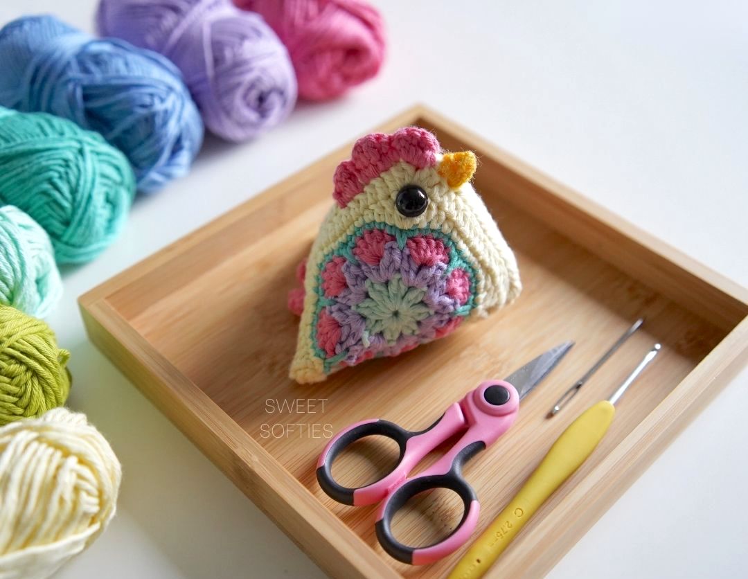
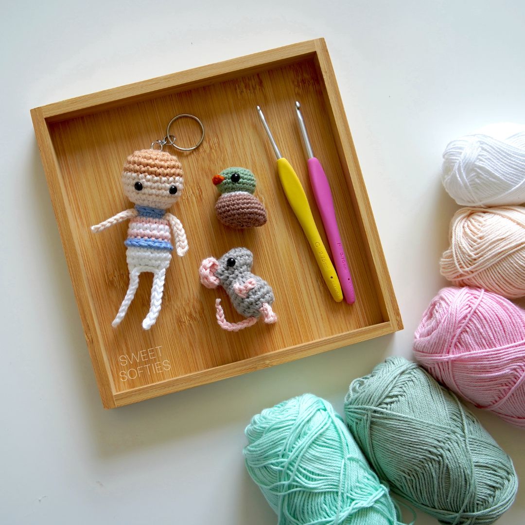
Pay attention to other types of hobbies, such as knitting wool, cross-stitch, and watercolor painting.
Good luck to you in creativity!
.jpg)


Іt's really a cool and helpful piece of information. I am satisfied that you just shared this helpful information
ReplyDelete